Quantcast
Channel: CPG Data Tip Sheet
Viewing all 67 articles
Browse latest View live

What’s New, Part I: How to Identify New Items in Your Category

$
0
0

Robin Simon

new icons

Manufacturers are constantly introducing new products. Although you know which new products your own company is introducing and when, it is also important for you to keep informed about your competitors’ activity. Depending on the resources at your company, you can do anything from annual analysis to on-going monthly (or even weekly) tracking.

This is the first in a series of posts that show how you can use your IRI or Nielsen POS database to conduct an annual analysis of all the new items introduced in your category.

  • Part I: How to Identify New Items  ⇐ this post
  • Part II: What to Include in An Annual New Item Summary
  • Part III: How to Tell The “New Item Story” for Your Category

Was it here last year? Look at Distribution

Another way of asking “which items are new?” is “which items were already here last year?” The simplest way to answer either of these questions is to look at distribution for all items in the category in the current period compared to the same period in the prior year. If an item has distribution greater than 0 in both years, then it is not new in the current year. See this post for more on distribution.

Since the focus of this post is identifying any new items in the category, we will be selecting the largest available Total US market.  (See this post on Total US markets.)  If your business is not national and more regional,  you could  do this for a specific region, market or groups of markets.  If you are calling on a particular retail customer, you may want to do this for that customer to see what new items they have taken on in the past year.

Run a query (IRI or Nielsen) that contains the following, making sure to have the Products in the rows and the Facts in the columns:

new items specs
* It is best to use current month.  Using the most recent week will understate the distribution for most items since distribution is based on where an item actually scans and not on where it is stocked.  Using a 52-week value will give you the average distribution across all 52 weeks, including all the zero weeks before the item was out there, not the most recent.

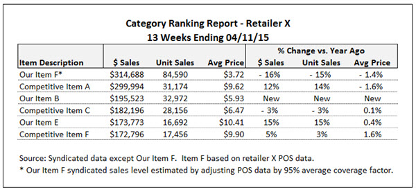
Your report will look something like this:

new items alpha

(Note that this example only shows 20 items in the category. Your category may have hundreds or thousands of items!)

Looking at this, it’s pretty obvious that items M, S and T are new since their change in distribution is the same as their current distribution. Therefore, they were not in-market during this same period last year.  If you sort the items in descending order of change in distribution, you can see that items F and G also appear to be new:

new items sorted

Obviously items M, S and T are the most interesting, since they are in relatively high distribution. Even though items F and G are also new, you may or may not want to do further analysis on them since they are in such few stores.  You could add another column to this data in Excel that indicates if the current distribution meets some minimum threshold (like 5 or 10% ACV) and also sort on that to more easily focus on new items with significant distribution.  But what about item C?  The change in distribution is almost the same as the distribution itself (50 vs. 53).  You may want to still consider this as a new item in the current year, even though it’s introduction began in the prior year.  One more column in the file could calculate the change divided by current distribution so you can more easily find items similar to  UPC C.  Doing that would show 1.0 for all truly new items and 0.94 for item C (50/53) but only 0.47 (7/15) for item K and 0.12 (7/60) for item N.

Another thing to watch out for when identifying new items are special packs (also called in-and-out items) that tend to be in-market for short periods of time – like bonus packs, bundle packs or pre-price.  Although these may show up in this type of new item analysis, they are really just variations of existing items.  You can usually recognize such items by certain abbreviations in the product description (like +1.5OZ or 99¢ PP).  It is important to be aware of such items but they are not really indicative of true innovation happening in the category.

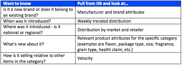
Once you have identified the most important new items, you’ll have some natural follow-up questions like:

  • Are the new items line extensions of existing brands or are they totally new brands in the category?
  • Were the new items introduced just this month or several months ago? We can’t tell just from this data. Maybe that’s why distribution is so low for items F and G – they could have been introduced last week while items M, S and T have been around for almost a year.
  • Are the new items regional or national?

My next post on New Items will focus on these and other things you’ll want to know about the new items.

Do you have a different way to identify new items? How often are you tracking competitive new items? We’d love to hear how you think about this. If you have other questions about new items in the IRI/Nielsen data, please contact us for a free 30-minute consultation or leave a Comment for this post.

Subscribe to CPG Data Tip Sheet to get future posts delivered to your email in-box. We publish articles every few weeks. We will not share your email address with anyone.

The post What’s New, Part I: How to Identify New Items in Your Category appeared first on CPG Data Tip Sheet. Copyright © 2014 CPG Data Insights.


What’s New, Part II: What to Know About New Items

$
0
0

Robin Simon

new icons

This is the second in a series of posts that show how you can use your IRI or Nielsen POS database to conduct an annual analysis of all the new products introduced in your category.  In this previous post I showed a way to identify the new items in a category, based on distribution.

Once you know what the new items are, these are some of the most common things you’ll want to know about them and can find out from your database:

new items table

New Brand or Line Extension?
You will of course be familiar with the leading players in your category so tracking all new UPCs is a good way to find out about other smaller (often regional) brands. By looking at Manufacturer (in addition to Brand) you may be surprised to find that a small, emerging brand could be owned by a much larger company. Several natural/organic brands are in fact owned by Kellogg’s and General Mills, for example.

When Was It Introduced?
Looking at weekly trended distribution allows you to see two important things: when a product started appearing in-market and how fast (or slow) it is taking to ramp up and reach its on-going sales level.   Distribution of some new items plateaus in a few weeks while others may take several months. Most new items from the same manufacturer reach their ultimate distribution level in about the same number of weeks and that timeframe is typically related to the goals that the salesforce has.

For some categories there may be too many new UPCs to do this for. If that’s the case, you may want to focus on the ones with the highest year-end distribution and/or sales. Keep in mind that many categories tend to have one or two general times of year when new items are introduced. These periods are usually related to when the retailers are resetting the aisle or section for those categories.

Where was it introduced?
If a new item has relatively low distribution it could be that it is only in a certain part of the country. When you look at distribution by market, you may see that a new item is only in the Northeast or only in the South. This is more common for regional brands (and also private label items for regional retailers). For national brands, you may see that only certain retailers have taken the new item. Sometimes Walmart (or another retailer) will carry something before anybody else does. When that happens, the other retailers will wait to see how the new item performs before agreeing to authorize it.

What’s new about it?
All products have a size, so that can be new regardless of category. Do the new items tend to be larger or smaller than existing items?   In this day and age of increasing cost pressures for manufacturers, it is somewhat common for a new item to be exactly the same as an existing one but in a slightly smaller size (for example 15 instead of 16 ounces or 10 instead of 12 packets). Flavor is often what’s new about a food or beverage item, while Fragrance is commonly new for personal care or household cleaning products. Grain type has been a hot area of innovation for many starch-based foods (quinoa, anyone?) while Gluten Free has also been popular in the new products arena. The database attribute “Type” or “Segment” differs by category. The Greek segment in yogurt has seen explosive growth while the Concentrated segment has been a bright spot for new detergents.

How well is it selling?
Sales measures (dollars, units, volume) will tell you how much of the new item is sold, but how does that compare with other items in the category? In order to have a fair comparison you need to look at velocity. This allows you to compare sales of items with different levels of distribution. This is especially important for new items, since they may still be building distribution. For items that were not introduced at the beginning of the year make sure to do a velocity comparison for a time period when the new items were available for purchase.  Keep in mind that retailers often look at velocity rankings to determine which items to keep or delete from their shelves.

In a future post I’ll show some data and how you can summarize what is happening with innovation in a category. If you have other questions about new UPCs in the IRI/Nielsen data, please Contact us for a free 30-minute consultation or leave a Comment for this post.

Subscribe to CPG Data Tip Sheet to get future posts delivered to your email in-box. We publish articles every few weeks. We will not share your email address with anyone.

The post What’s New, Part II: What to Know About New Items appeared first on CPG Data Tip Sheet. Copyright © 2014 CPG Data Insights.

What’s Your Data Focus? Retail Store Data or Shopper Panel Data?

$
0
0

Sally Martin

Store vs. Shopper DataFor my last couple of posts, I’ve been talking about the four types of retail sales data, formed by a combination of two parameters: data source (syndicated vs. retailer direct) and data focus (store vs. shopper).  In this post, I’ll discuss data focus in detail, laying out the strengths and weaknesses of each data type for answering your business questions.

Retail sales data can focus on either stores (where all the transactions for a specific UPC are grouped together) or shoppers (where individual transactions by individual consumers are analyzed).

IMO, the difference between store and shopper is even bigger than the difference between syndicated and retailer direct because the size and structure of the underlying data and the questions it answers are so very distinct.

In the syndicated world of Nielsen, IRI, and SPINS, the shopper data is called household panel data. In the retailer direct world, it would typically be loyalty card or frequent shopper program data.

Store Data

Store data is the most easily accessed and commonly used data. It’s collected through POS (point-of-sale) in-store systems. You’ll also hear this type of data referred to as “scanner data”.

Retailer direct data store may provide information on individual stores (though that’s rarely useful for market research, as opposed to supply chain or logistics, purposes). Syndicated store data will rarely be available for individual stores. Instead, syndicated data groups stores into various types of markets (geographic markets, channel totals, individual retailers).  Comparing market sizes is one of the strengths of syndicated data.

Store data is great for understanding sales trends and analyzing distribution, price and trade promotion. Once you have the data, you can analyze any time period, from one week to multiple years. The data is incredibly robust—you never have to worry about things like sample size!  It’s also generally less expensive to purchase and easier to manage and analyze.

There are many articles in this blog about syndicated store data and many of those concepts will apply to working with retailer direct store data. Distribution, price, and trade promotion are the three business areas most commonly and most effectively addressed with store data.  Here is one article for each topic to get you started:

Shopper Data

The defining characteristic of this type of data is that it links purchases to a specific individual or household over some period of time. Syndicated panel data is at the household level. Retailer direct data varies but can sometimes focus on individual shoppers rather than grouping them into multi-shopper households.

Shopper data analysis focuses on issues like loyalty, purchasing patterns over time, share of wallet, cross purchasing, and buyer demographics. Usually shopper data analysis focuses on longer periods of time to capture those nuances and changes in consumer behavior.

Syndicated household panel data from Nielsen, IRI, and SPINS relies on a relatively small but very representative set of consumers.  Sample sizes can be an issue depending on your products and questions.  But the completeness of the buying behavior picture is unparalleled.  In fact, since syndicated panel data covers all purchases for a specific group of households, you may be able to get information about retailers that don’t provide store data (like Whole Foods) or, occasionally, channels not covered by store data (like Office Supply).

Retailer direct loyalty card or FSP data, when available, is voluminous. It can include every transaction for every shopper at that chain. So a picture of buying behavior, at that retailer, can be obtained for even small and infrequently purchased products. However, certain types of questions cannot be addressed since it’s only a piece of the shopper’s behavior. For example, you cannot look at share of wallet since you don’t know what the shopper spent in other retailers and other channels.

To learn more about shopper data metrics, take a look at these past blog articles:

Household panel and shopper data is incredibly powerful but can be tricky to analyze. Need help with your household panel data?  We’re experts!  Contact us to discuss how we can help you gain more consumer insights from your syndicated data.

Did you find this article useful? Subscribe to CPG Data Tip Sheet to get future posts delivered to your email in-box. We publish articles once or twice a month. We won’t share your email address with anyone.

The post What’s Your Data Focus? Retail Store Data or Shopper Panel Data? appeared first on CPG Data Tip Sheet. Copyright © 2014 CPG Data Insights.

The Digital Divide in Grocery and CPG Data

$
0
0

Guest

The Digital Divide in CPG Data

We’re delighted to have guest contributor Keith Anderson, vice president, strategy & insights for Profitero, sharing his expertise in ecommerce intelligence.  Please direct comments and questions directly to Keith. His contact details can be found at the end of this article. 

Ecommerce growth is exploding. But what data is really available to CPG companies accustomed to data-driven strategic planning and execution?

While total retail growth barely outpaces inflation, online retail continues to grow at 3-5x the pace. According to the US Census Bureau, in the fourth quarter of 2014 (the latest period for which data is available), ecommerce sales increased by 14.6% year-over-year, while total retail sales increased 3.7%.

Note: For the sake of this discussion, “online retail” and “ecommerce” includes purchases transacted online, including those picked-up at or fulfilled from a brick-and-mortar store.

  • Walmart and Target are accelerating investments in programs like online grocery pick-up and subscriptions for everyday essentials.
  • Amazon, ever-evolving, launched its national Prime Pantry program for shelf-stable CPG products and is expanding AmazonFresh, its full-basket grocery delivery model, to new markets.
  • Well-funded entrants like Instacart, Boxed, and Jet are poised to lead another wave of innovation.

Though grocery and CPG products are among the most under-penetrated categories online, some industry analysts believe that 2015 is an inflection point for the industry. A joint study released by IRI, Google, and Boston Consulting Group in August 2014 projects that online share of CPG sales will follow a “1-5-10” trajectory, from 1% of sales in 2014 to 5% by 2018, with 10% share a realistic possibility as growth compounds. Online growth will account for about 50% of total CPG growth over the period.

With around 1% of all CPG products currently purchased online, much of that share shift is still ahead. For context, the study cites categories like Toys, Sporting Goods, and Small Appliances, each of which has online penetration rates over 10% and whose online growth accelerated after reaching a “digital tipping point”.

Even within the broader grocery and CPG landscape, some categories are likely to accelerate online faster than others. Shelf-stable products with higher price-to-weight ratios are likely to migrate more quickly. Amazon is reported to be a top five customer of P&G’s Pampers brand, for example.

Other sub-categories like perishable products create logistical complexity that may lead to a different growth curve.

Still, markets like the UK and France and the growth of click-and-collect and models like Instacart illustrate the increasingly viability of online grocery, even for perishable goods.

A separate Deloitte study estimates that 29% of US grocery sales are digitally influenced, amplifying the impact.

Data: The Digital Divide

Despite the growth and assumed superior measurability of online retail, most CPG companies are at a data disadvantage online compared to offline.

Fundamental data on the total online retail market like category size, growth rates, and brand shares are largely unavailable at the level of detail and frequency that CPG manufacturers have come to expect for brick-and-mortar retail.

From a shopper data perspective, the situation is better – online behavioral panels (which monitor shoppers’ actual online behaviors through various tracking methods) are inherently more scalable than self-reported panels commonly used for in-store retail (which simply ask shoppers to recall their behavior). But these too have their limitations.

There are three types of data available now for assessing CPG online retail. I’ll cover each in turn.

1) Retailer direct data

As Sally explained here, retailer direct data is supplied to manufacturers directly by individual retailers and is typically limited to that manufacturer’s own products, sometimes with category totals.

Compared to retailer direct data for offline sales, there’s a lot of maturing still to do for online sales.

Ideally, all online retailers would provide daily, product-level data on unit and dollar sales (among other metrics). Unfortunately, some retailers only provide data aggregated to the brand level; others on a monthly or quarterly basis; and still others share nothing at all.

For manufacturers, the utility of this data is mostly limited to analyzing their business with an individual online retailer, since synthesizing and standardizing data from various retailers is a major challenge.

Still, there are signs of improvement:

  • Peapod has invested in its data and analytics capabilities and now provides data to manufacturers in both free and premium versions, including alignment with data for Ahold’s stores
  • Walmart is reportedly enhancing its Retail Link direct data platform to improve its ecommerce reporting capabilities
  • Amazon has set the gold standard for online direct data with Amazon Retail Analytics (ARA), available in free and premium versions

Just as specialty data and analytics firms like Dunnhumby emerged to leverage brick-and-mortar retailers’ direct data, vendors like One Click Retail (which specializes in Amazon analytics) are emerging to help manufacturers unlock value in online retailer direct data.

2) Syndicated data

As in the offline world, syndicated data comes in two primary flavors: shopper data and sales data.

Shopper Data

Household panels operated by leading syndicated data providers like IRI and Nielsen already integrate self-reported online purchasing attitudes and behaviors.

Additionally, online behavioral panel operators like ComScore and WPP’s Millward Brown Digital provide analytics on shoppers’ observed behaviors on desktop and mobile devices.

Many of these players have partnerships, so it’s worth asking each vendor what’s available.

Sales Data

Unlike offline, the largest online retailers have not been persuaded to pool their transaction data for their (and the industry’s) benefit.

However, demand for a total-market view is growing by the hour as ecommerce growth and share gain continue to accelerate. I expect progress this year and encourage commercial leaders, analysts, and shopper marketers to ask retailers and data vendors what to expect and when.

3) Ecommerce intelligence

Online retail storefronts themselves are another key source of data. This data is similar in-store audit data, without ever having to set foot in a store.

Companies like my firm, Profitero, monitor the “digital shelf”—essentially anything a shopper would see on an online retailer’s homepage, category page, search result page, or product page.

Analytics focus on critical performance drivers in areas like pricing and promotion, product and assortment attributes, product content (images, titles, descriptions, ratings & reviews), and search and category ranking.

Because this data is collected independently of retailers and is driven by technology, it has some interesting characteristics:

  • Data can be collected for any retailer, in any language
  • Competitive data can be collected for benchmarking and analysis
  • Data can be collected daily (or more frequently) and locally for online retailers with local assortments, pricing, and stock (like Peapod and AmazonFresh)
  • Digital shelf data can be aligned and integrated with existing Nielsen or IRI hierarchies and retailer direct sales data (where available)

For an example of this kind of intelligence, check out Profitero’s free monthly Amazon FastMovers reports, which benchmark best-selling products in 10 categories at Amazon in the US and UK including Grocery & Gourmet Food, Baby, Beauty, Chocolate, Health & Personal Care, Pet Food, and more.

By itself, ecommerce intelligence is a rich new source of insight for CPG manufacturers. But we see even more long-term potential in tying this data to complementary sources of syndicated and retailer direct data.

Getting Better Every Day

There’s no question that CPG companies deserve better, more actionable data on the fastest growing channel of their industry.

But there’s a long way to go, and retailers, syndicated data providers, and manufacturers will each play a role in advancing the industry. 2015 should be a year of progress.

About the Author

Keith Anderson is vice president, strategy & insights for Profitero, a venture-backed global provider of ecommerce intelligence for retailers and brands. He leads Profitero’s product strategy and premium analytics services.

He can be reached at keith@profitero.com, @KeithAnderson, or on LinkedIn.


The post The Digital Divide in Grocery and CPG Data appeared first on CPG Data Tip Sheet. Copyright © 2014 CPG Data Insights.

Size of the Prize: Quantifying Your Fair Share of Distribution

$
0
0

Robin Simon

4.21.15 pic1

In a previous post, I explained the concept of “fair share of distribution” and how you can determine if your brand is getting the distribution it deserves.

Now I’ll show you how to quantify the size of that opportunity, for both your brand and the category, if you are getting less than your fair share.  Let’s use the dataset below.  To keep things simple we’ll assume that these are the only 2 brands in the category.  (If you aren’t familiar with the measures TDP and Sales per TDP, you may want to review those before continuing.  Those measures will be used in the example below.)

4.21.15 pic2

 Key takeaways:

  1. Brand B is not getting its fair share of distribution since it has 70% of the dollar sales but only 52% of the TDPs. This works out to be a fair share index of only 74 (= 52 / 70 * 100). Remember that if the index is under 100 (like this one is), then there is an opportunity to convince the retailer that you deserve more distribution.
  2. Brand B has a higher velocity than Brand A, $161.44 vs. $73.53. (Sales per TDP is just what it sounds like: sales / TDPs. This is $350,000 / 2,168 = $161.44 for Brand B.)
  3. Brand A has greater than its fair share of distribution, with an index of 162 (= 48 / 30 *100).

These 3 points taken together provide a great story for Brand B to gain/steal distribution from Brand A. This will increase Brand B sales by almost 36%, or over $125,000. Plus…category sales will increase by almost 14%, or over $68,000. (Unfortunately if you are Brand A in this scenario, you would lose distribution and sales would go down more than -38%.)

Here’s how to calculate those opportunities for Brand B and the category:

  • Calculate what Brand B’s TDPs should be at fair share. (We will assume that category distribution remains at 4,208 TDPs.) If Brand B has 70% of dollar sales then they should also have 70% of the category TDPs, so

0.70 * 4,208 = 2,946

  • Determine how many TDPs Brand B needs to get from Brand A to reach that fair share level, so

2,946 (fair share TDPs) – 2,168 (current TDPs) = 778

  • Calculate the dollar opportunity for Brand B as the additional TDPs * velocity per TDP, so

778 * $161.44 = $125,535
And the percent growth over current sales is
(new sales – current sales) / current sales = $125,535 / $350,000 = +35.9%

  • Calculate the dollar opportunity for the category as the difference in velocity per TDP between Brand B and Brand A * the number of TDPs that are changing from Brand A to Brand B:

($161.44 – $73.53) * 778 = $68,359
And the percent growth over current category sales is
+13.7% = $68,359 / $500,000

If you find that your brand is not getting its fair share of distribution and it has a higher velocity than a competitor, now you know how to use that information to convince a retailer to shift some distribution from that competitor to your brand.

Have other questions about how to quantify opportunities with specific retailers? Leave a Comment for this post and we will try to answer as best we can.

Did you find this article useful?  Subscribe to CPG Data Tip Sheet to get future posts delivered to your email in-box. We publish articles about once a month. We will not share your email address with anyone.

The post Size of the Prize: Quantifying Your Fair Share of Distribution appeared first on CPG Data Tip Sheet. Copyright © 2014 CPG Data Insights.

Size of the Prize: How Much Is One More Point of Distribution Worth?

$
0
0

Robin Simon

pt of acv 1

In this previous post I explained how to quantify the size of the opportunity for both your brand and the category if you are getting less than your fair share of distribution. This time I will show how to quantify the impact of getting your brand into more stores, regardless of your current share of distribution. Before continuing, you may want to review this information on %ACV Distribution.

Let’s use the following data for this example:

pt of acv 2

Brilliant Brand currently has annual sales of $500,000 in retailer Fantastic Foods. But…they are only in 62% distribution. We will calculate how much more Brilliant Brand could sell in Fantastic Foods for each additional point of distribution they can get. That way we’ll be able to answer “how much more would be sold if the brand were in 70% distribution? 75%? 80? etc.” Although Brilliant Brand would like to be in 100% distribution, it may not be realistic to get into every store so knowing how much they get for each point of distribution allows us to quantify the opportunity of getting any additional point of distribution.

They key to this analysis is to calculate the velocity (or pull it directly from the database if it is available there). Velocity tells you how well your product sells when it’s available to consumers on the shelf. Read more about the measure here. For this analysis we will use $ sales per point if distribution (often abbreviated as “$ SPPD”) as the velocity measure.   In our example $ SPPD is $8,065, calculated as follows:

$ SPPD velocity = $ Sales / %ACV Distribution, so

$500,000 / 62 = $8,065

For every point of ACV distribution at Fantastic Foods, Brilliant Brand sells $8,065.  (Note:  On average, you can assume that the brand will sell that same amount for each additional point of distribution.  If the distribution is already quite high – maybe 80% ACV or higher – you may want to use a somewhat lower velocity.  “Better” stores often take products earlier so the stores added later have lower velocity.)

Now we can use that velocity to understand the size of the opportunity as the brand reaches different levels of distribution.

pt of acv 3

Looking at row A in the table above, the brand reaches 75% ACV Distribution. This is an increase of 13 points above the current distribution (75 – 62 = 13). An extra 13 points of distribution is worth almost $105,000 annually (13 * $8,065 = $104,839). And that is 21% higher than the current annual sales ($104,839 / $500,000 = 0.21 = 21%).

If Brilliant Brand can get to full distribution of 100% at Fantastic Foods (row B in the table above), the opportunity is over $300,000, a 61% increase over current annual sales. The improved annual sales are $806,452.

pt of acv 4

Now you can quantify the sales you are missing if your products are not in full distribution, either at the brand or item level and at a specific retail customer or across any channel or market. This analysis works for any product and any geography available in your database. Of course you’ll need to convince the retailers that our brand deserves to be in more stores and that can be done by showing them you’re your velocity is [hopefully] higher than the competition.

Did you find this article useful?  Subscribe to CPG Data Tip Sheet to get future posts delivered to your email in-box. We publish articles about once a month. We will not share your email address with anyone.

The post Size of the Prize: How Much Is One More Point of Distribution Worth? appeared first on CPG Data Tip Sheet. Copyright © 2014 CPG Data Insights.

All About ACV

$
0
0

Sally Martin

All Commodity VolumeEarlier this year, we received a frustrated email from a reader. He wrote: “Once and for all, I would like to know exactly what ACV is. You hear several definitions depending on the site you visit. Then I would like to know how to calculate it, what it tells me, and why suppliers should care.” A great list of questions about an important CPG metric!

First, what is ACV? ACV stands for All Commodity Volume. It is total retail dollar sales for an *entire* store across all products and categories. In the world of CPG, it’s a common way to measure the size of a store or retailer. Rather than a measure of physical size, like square footage, ACV reflects how much total business is done in that outlet.

Why would a supplier of a specific product care about overall retailer ACV? If you are looking to expand distribution, ACV can help you prioritize opportunities. Generally speaking, the bigger the retailer’s volume, the bigger the sales potential for your product. And ACV trends will give you perspective on the business health and growth potential for that retailer.

One source for data on retailer ACV is industry trade publications and company annual reports. For example, here’s a Progressive Grocer ranking of the top 50 supermarket chains which includes information on total retail sales.

If you purchase a Nielsen/IRI database, you can calculate total retailer ACV across all products (even if you are buying data only for one specific product category). I wrote a post on how to back into that ACV estimate.

So that’s what exactly what ACV is. Seems pretty straightforward, right? Why would my reader feel confused by seemingly different definitions? Probably because ACV is also an *input* into the most commonly used syndicated distribution measure, called “% ACV” aka “ACV Weighted Distribution”. Sometimes, when people use the term “ACV” they really mean “% ACV”. We’ve written buckets of posts about % ACV (start with this one) so I’m not going into detail on this most important of distribution measures. But I do want to illustrate here how % ACV is calculated, how it relates to raw ACV, and what it means to “weight” distribution. Here is a simple example of a market made up of 3 stores:

Store ACV

How big is this market overall?

Total Market ACV = 40 + 60 + 80 = $180 Million

What is distribution for Product X? There are two answers, depending on whether you are looking at unweighted or at weighted distribution:

Unweighted distribution = % of stores selling = 2 ÷ 3 = 67%

ACV weighted distribution = % ACV = (60 + 80) ÷ 180 = 78%

% ACV distribution is calculated by looking at total ACV in the stores where a product scanned, divided by total ACV for the market. Because Product X sold in the two larger stores in this three store market, its % ACV distribution is higher than its % of stores selling.

Why is % ACV considered the more insightful measure of distribution for your product? Because it represents your exposure to consumer spending. Sales potential in a high ACV store is theoretically better for every product, including yours. So you want to give your product more distribution “credit” for selling in those higher ACV stores.

Because ACV is used to calculate % ACV Distribution, you will see the term “ACV” in other measures as well (promotion measures and velocity measures). It all comes back to using ACV to weight distribution, though, no matter what the measure. So if you understand that concept, then you understand everything you need to know about how ACV is used in syndicated data.

I’ll end on this nerdy side note that may be of interest to some data obsessed readers: when Nielsen and IRI calculate the ACV that they use for weighting, they exclude some departments like lottery and pharmacy and gasoline because not all stores have those departments. Because of that, Nielsen/IRI ACV for a retailer may not match total retailer sales numbers reported in annual reports or other sources. Contact your data supplier for their specific list of departments included in/excluded from their ACV numbers. Note that ACV is usually updated on an annual basis.

Still have questions about ACV? Leave a comment below or  contact us and we’ll do our best to answer your question.

Subscribe to CPG Data Tip Sheet to get future posts delivered to your email in-box. We publish articles about once a month. We will not share your email address with anyone.

The post All About ACV appeared first on CPG Data Tip Sheet. Copyright © 2014 CPG Data Insights.

8 Questions To Ask When Combining Multiple Data Sources

$
0
0

Sally Martin

combining data sources
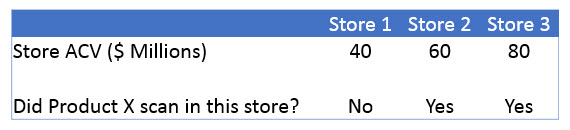
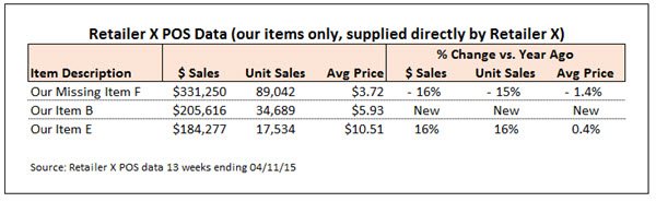
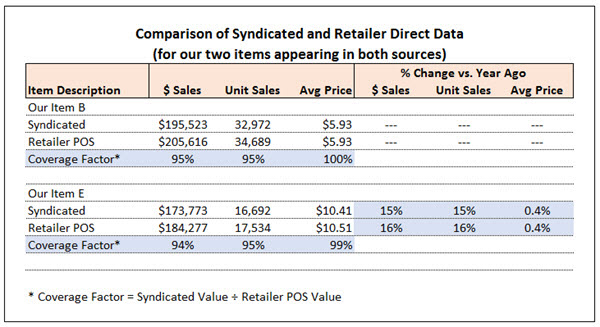
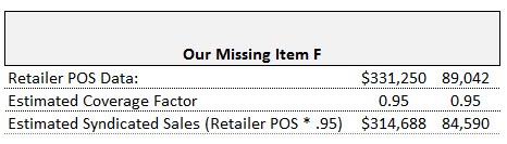
One of the advantages of syndicated store data is that it provides you with the most comprehensive retail sales picture you can obtain from a single source. But sometimes you can get greater insight and formulate more powerful arguments by enhancing your syndicated data with information from other sources.

Combining data sources can be tricky. Sometimes the translation and estimation required will outweigh the benefits. Sometimes the data blends so poorly it leads you to incorrect conclusions.

How do you avoid these trouble areas? In this post, I’ll walk you through a checklist of questions to ask yourself before combining data sources. Then, I’ll give you an example of how I applied this checklist, enhancing a syndicated data ranking report with retailer POS data.

A Data Integration Checklist

When deciding whether to integrate multiple data sources, you should ask yourself some critical questions first—and a checklist is perfect for this. Start by considering where the data comes from:

  1. Do the data sources measure the same thing? And don’t just answer “yes they both measure sales”! Think more closely about what behavior is being measured.
  2. Is the data collected the same way? For example, is it passively scanned? Or manually reported? By whom? Where and how?

Then consider the four dimensions that underlie most CPG data:

  1. Do the time periods match?
  2. Do the product definitions match?
  3. Do the market definitions match?
  4. Do the metrics (and the way they are defined) match?

If things are still looking good, proceed to the final two questions:

  1. Can I make a direct comparison of any data points in both sources to see how well they match?
  2. Does the data trend the same way? (If one source shows sales going up and the other shows sales going down, that’s a red flag!)

The more you answer “yes” to these questions, the better you can feel about integrating the data and drawing conclusions. If some of your answers are “no,” that doesn’t mean you can’t combine the data, but you should be cautious. You should show your results side-by-side rather than merging the data or present conclusions as directional rather than firm.

A (Very) Simple Data Integration Example

Let me show you an example of how I applied this checklist for a client.

My client purchases syndicated data for their category but the data vendor’s category definition excludes some of my client’s products. This is not uncommon – often there are differences between the manufacturer, data vendor, and/or retailer view of the category definition. Unfortunately, the missing items were top sellers for a key retailer—so of course my client wanted to include those missing items in their presentation to that customer. What to do?

My client had two options for filling in the data for the missing items: POS data obtained directly from the retailer and internal shipment data. We started by applying the first two checklist questions—do the data sources measure the same thing and is the data collected the same way? On these two dimensions, retailer POS data was the obvious winner. Both retailer POS data and syndicated data measure consumer consumption (sales from retail stores) and they’re both gathered by POS scanners. In contrast, shipment data doesn’t match syndicated data on either dimension. It’s not measuring the same thing: shipments reflect what is sent to retailers, not what consumers buy from retailers. And the data is gathered a different way since shipment data is not collected via POS scanners.

Retailer POS data also did well on the four next checklist questions: time periods, products, market definitions and metrics. I could precisely match time periods, UPC level data was available in both sources, my syndicated data included all stores for this specific retailer, and I could get both dollars and units in both places. Bullseye!

So merging syndicated and retailer POS data was (theoretically, at least) very reasonable. But how well would it work in reality? To find out, I followed the final two checklist questions and pulled data from both sources to compare data points and look for trends.

First, I took a look at the syndicated ranking report. Here’s a shortened, masked version of that report:

combining data sources 1

As is typical of retailer POS data, my client could only get data for their own items. Here’s how the retailer data looked for the items my client supplied:

combining data sources 2

Since two of my clients’ items (Our Item B and Our Item E) appeared in both reports, I was able to make a direct comparison between data sources, comparing absolute sales levels and also trends:

combining data sources 3

On average, in this case, my syndicated data was about 95% of the retailer POS data. In CPG data language, we would call that the “coverage factor”.  Coverage factor is most commonly used when comparing shipments and consumption but it applies here as well.  We’re looking at how well the syndicated data covers another, internally generated source of sales information.

The average retail prices lined up well between sources and so did the volume trends so everything looked good. Consequently, I added the missing item into my ranking report after reducing the POS volume by 5% (using the adjustment factor). In this case, I chose to adjust the retailer POS data down by 5% to match the syndicated data because the vast majority of the information in the report was syndicated. An alternative approach could have been to increase all the syndicated data by 5% to match the retailer POS data, since the POS numbers might be considered “right” and the gold standard by the retailer.

combining data sources 3.5

You may have noticed that coverage averaged slightly lower for dollars than units. Despite that, I stuck with an overall average adjustment for both measures rather than using 94.5% for dollars and 95% for units. In my opinion, if things are close, it’s better to keep things simple and consistent. Resist the urge to overthink or refine things too narrowly. When you start splitting hairs, it’s easy to get confused and/or confuse your audience.

I used the trend data (% change vs. year ago) and prices directly from the retailer POS with no adjustment. New average prices could have been recalculated from the adjusted dollar and adjusted units but that wouldn’t have changed their values in this case. I generally don’t adjust trends – I always feel that is moving in the direction of making up numbers.

Here’s the final ranking report I created, including the missing item. I was careful to explain what I had done and what assumptions I had used in a footnote.

combining data sources 4

Was this report worth the effort? Absolutely! It turned out that the missing item ranked number one. The report also revealed that sales for this item had dropped—which gave us another area to investigate.

In this example, I integrated syndicated store data and retailer POS data. To read more about comparing syndicated store data and shipment data, check out Robin Simon’s post here. A third type of data commonly combined with syndicated store data is household panel data. Learn more about the differences between store data and panel data here. The checklist of questions introduced above will apply any time you combine syndicated data with these or any other data source.

What is your experience integrating multiple data sources? Share your stories by commenting below.

Subscribe to CPG Data Tip Sheet to get future posts delivered to your email in-box. We publish articles about once a month. We will not share your email address with anyone.

The post 8 Questions To Ask When Combining Multiple Data Sources appeared first on CPG Data Tip Sheet. Copyright © 2014 CPG Data Insights.


How to Be a Great Data Analyst

$
0
0

Sally Martin

Better Analyst Insights
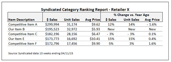
Despite the promise of software vendors that their “methodologies extract meaningful and actionable insights from Big Data,” my experience is that no methodology can substitute for the human brain of an astute analyst. Great data analysts are a rare and valuable commodity. So what makes for a great one?

  1. They know the data inside and out
  2. They deliver accurate information
  3. They draw useful conclusions.

Most articles on this blog have focused on the first point—knowing your data. And this point alone can take you a long way in your career. But in this post, I’m going to tackle the third, softer and squishier realm—how to draw useful conclusions.

One of my colleagues contends that great analysts are born, not made. There may be some truth to that. (I do think a certain inate mindset makes for a good analyst. Curiosity, attention to detail, ability to solve problems are three qualities that come to mind.)

But at the same time, you can always improve your craft and learn from others. (I certainly do!) So here are some of the things I do regularly to improve the quality of my insights and conclusions. These tips can be applied to any type of data.  They reflect a mindset and approach, not a recipe to follow.

Understand the Business Questions Driving the Analysis

You’ve heard this a million times, but it’s easy to forget when you’re rushing to fulfill a data request: Pause to ask a clarifying question. It’s the number one way to add value when you’re presented with a “business question” that’s phrased as a data order.

How do you do this in practical terms? Ask: “Can you give me more background on your data needs?” or “What are you going to use this information for?” or “What type of decision will you make with this data?”

Separate Analysis Process from Communication Process

Yes, you want to understand your audience’s needs and keep them in mind. But don’t start your analysis thinking about how you’ll communicate your answers. To commence work by attempting to look at data in a way that’s “right for your audience” will constrain your thinking and quality of your analysis. Instead, pull the data you need to draw your conclusions. Create graphs for yourself and delve into whatever details you want to examine. It’s never a waste of time to conduct an analysis for yourself first. For example, I usually do some graphing of data over time—often weekly data—to get a handle on trends. But I rarely show those graphs to clients. Only after I draw my final conclusions and think about the points I’m going to make do I decide how to visually display the information in summary form, targeted to the needs of my audience.

Be Creative About Finding Benchmarks and Other Ways to Add Context

Pointing out a single number or trend isn’t terribly enlightening. What brings insight is adding context, by comparing other products, other markets, other measures or other periods. For example, dollars are up, but what about units? This brand is down but what about the category? This category is flat but what about adjacent categories or the market as a whole? This retailer looks strong but how are they doing versus their competitors? We’re up versus last quarter but what about versus a year ago?

One of the most powerful tools of syndicated databases is how much context they contain (or how much more context you can buy if needed). Challenge yourself and exercise your creativity in finding multiple ways to add context. Not everything will pan out, but you won’t know until you look.

Drill Down One Level Deeper

You often need to drill down into more details than you’d like, to really understand what’s going on. It would be faster and less messy to stay high level but, invariably, it doesn’t work. For example, when I’m doing a retailer business review for a client, I pretty much always end up graphing UPC level distribution by week. For me, figuring out when new items appeared and when older items were discontinued is often the key to explaining what’s driving the big picture trends. In my experience, there’s rarely a substitute for a deep understanding of what’s happening in the data at a detailed level.

Rise Above the Details

A great analyst is a contradiction: you need to be both very detail oriented and big picture/strategic. It’s hard to find that balance. In my experience, it often requires deliberately swinging back and forth between details and a big picture perspective. When I’m mucking around in detailed data, sometimes I feel like I’m spinning my wheels. Then I remember to ask myself, “What’s really going on here?” and revisit the big picture question. In retrospect, it may seem like you spent more time in the muck than you needed to. But that’s part of the process. You have to go deep, then pull up; go deep and pull up. Here are some tactics to help keep the big picture in mind:

  • Summarize what you’ve learned in a few sentences (no numbers).
  • Guess what someone will ask you when you present your findings.
  • Ask yourself what you would do, given what you’ve learned.
  • When you think you are done, ask “why [fill in your conclusion]” and see if you can think of a way to go one layer deeper.

Want to read more about how to be a better analyst? Here are some links I like. Two of them are specifically about web analytics but the general principles they describe are relevant for any analyst in any industry.

Top Ten Signs You Are a Great Analyst, Avinash Kaushik, Occam’s Razor

13 Traits of a Good Data Analyst, George Kuhn, Research and Marketing Strategies

What Makes a Good Analyst, Neil Mason, ClickZ

Knowledge Workers are Bad at Working (And Here’s What to Do About it…), Cal Newport, Study Hacks Blog

In my next post, I’ll  share some techniques for improving on my second great analyst requirement: delivering accurate information.  In the meantime, I would love to hear your thoughts on how to deliver more value as a CPG (or any other type of) data analyst. If you have other “better analyst” articles you like, please share those as well!

Subscribe to CPG Data Tip Sheet to get future posts delivered to your email in-box. We publish articles about once a month. We will not share your email address with anyone.


The post How to Be a Great Data Analyst appeared first on CPG Data Tip Sheet. Copyright © 2014 CPG Data Insights.

Six Ways To Reduce Your (Inevitable) Data Errors

$
0
0

Sally Martin

Data AccuracyWhat are the three most important qualities of a great data analyst?

1. They know their data inside and out
2. They draw useful conclusions from their data.
3. They deliver accurate information

Robin and I have written many articles addressing quality number one (knowing the data), which provides a solid base for a successful career as a CPG data nalyst. I recently tackled the tougher-to-teach skill of drawing useful conclusions. Now, in this post, I’ll address the third item on the list: delivering accurate information.

Great analysts are relentless about quality control. But that doesn’t mean they don’t make mistakes. They do—guaranteed. I’ve been analyzing data for over 30 years (starting as a research assistant in college), and I still make data errors regularly. The question is, who finds the mistakes? You? Your boss? Your boss’s boss? Your (gulp!) client? It’s always better to catch your own errors. Here are some of the methods I use:

1. Be skeptical and dubious about your own work

Don’t assume your numbers are right. Assume they could be wrong and regularly double check things as you work. This mindset will help you avoid most errors.

2. Be extra suspicous of surprise findings

Sales are up 50 percent this month when they’ve never been up more than 5 percent any month in the past year? Time to double check your calculations and confirm there’s not a data error.

3. Don’t type in numbers

Try to avoid manually inputting numbers at any point in the process. For example, when I’m making a PowerPoint chart, I copy and paste from Excel even if it’s just a couple of numbers. Linking can also help reduce data transfer errors though (in my personal experience) linking can also add to data problems so use linking carefully and sparingly.

4. Don’t move data around manually

Just as manually inputting data can introduce errors, so can manually moving data around. For example, if you pull data from some larger system (Nielsen, IRI, retailer POS, whatever) and then realize the columns aren’t in the right order, don’t reorder them manually. Instead, go back, respecify the data request, and let the ideal column order roll in automatically. By the way, I broke this rule the other day and immediately made a mistake—I moved the data without moving the headings, which mixed up retailer names. Luckily, I realized my error because I followed the next rule:

5. Make a habit of cross checking numbers

It may take you a few minutes to figure out the best way to do this. You might have to add an extra step to the process or pull some extra data. But take the time to do it, consistently. I promise you that extra effort will pay off, eventually, in a big way. Here are a few examples of cross checks I use:

  • Compare grand totals from one report to another. This cross check works when you’re looking at the same data set through various lenses. For example, one category report shows brand totals and another shows segment totals. But the grand total should be the same on both reports – compare them and make sure that total really does match. Even if the report or analysis doesn’t include a grand total, create one so you can do the check. You’d be surprised how often this simple exercise uncovers an error!
  • Make sure custom subtotals add up. Example: You’ve created two custom time periods that divide up a year of data based on when a new product was introduced. Now, as a cross check, add your two pieces together and compare to the 52 week total that’s undoubtedly available from the original data source. Ensure the numbers match.
  • Compare current trends to similar numbers from an earlier period or report. Make sure the differences and/or changes are plausible.
  • Compare a few data points to the original data. This is key after doing a lot of data manipulation. To make sure you can do this, clearly label and save a copy of your fresh, pristine data before beginning to make changes. Because I am truly distrustful of myself, this is often not even enough for me and I will go back and pull fresh numbers from the master data source to make sure nothing’s been lost along the way.

6. Proofread one more time, preferably the next day

If you can possibly avoid it, never send off a final analysis without taking a break from it, whether it’s a day or a few hours. Your subconscious will work on it in the meantime, and sometimes you’ll see errors you missed or find new implications.

It’s hard to build these methods into demanding timelines—it requires a lot of discipline—but it’s worth it. I’ve improved on this a lot since my early days—when I would write conclusions the morning of client presentations!

What are your tips and tricks for improving accuracy? We’d love to hear them, as would your fellow readers. Please share in the comment box below.

The post Six Ways To Reduce Your (Inevitable) Data Errors appeared first on CPG Data Tip Sheet. Copyright © 2014 CPG Data Insights.

Volume Decomposition, Part 1: Why Are Sales Up (or Down)?

$
0
0

Robin Simon

due-to signpost

Has this happened to you?  Sales of your brand are down vs. the same period last year and management wants to know why.  Sales is saying it’s because there is less advertising this year but Marketing is saying it’s because you’ve lost distribution and the retail price and merchandising are not as competitive.  Another, more pleasant, scenario is that sales are up and Marketing says it’s because of the addition of more advertising this year but Sales says it’s coming from distribution gains and lower pricing.  How do you know what the real answer is?

Since there are many different business drivers that impact sales, the challenge is to estimate how much of the volume change was due to any number of things that were taking place at the same time.  In fact, it is often things that are happening in the store at the point of purchase that have the biggest and most immediate impact on sales.  Fortunately, your IRI/Nielsen database has the data to enable you to look at those retail drivers.  By accounting for as many business drivers as possible, you can get to a decent answer to the question of why sales are up or down.  This post is the first in a series on decomposing a change in volume into its component business drivers.  Future posts will address specific drivers and how to quantify the impact of them on the business.

Due-To Analysis, aka Volume Decomp

An analysis like this is often called a “due-to,” because it tells you how much of the sales change is due to each of the drivers.  It is also known as a volume decomp (short for volume decomposition) or volume bridge (since it bridges the volume from one period to another).  Many of the largest CPG companies have tools from IRI/Nielsen that do this analysis automatically, but smaller companies may not.  Find out if your IRI or Nielsen contract includes a volume decomp tool.  If it doesn’t, it’s usually because of budget constraints but the good news is that you can conduct the analyses described in this and future posts to get to a good approximation of what is driving your business.

First up, what do you want to explain?  See this post about the 3 ways to measure sales – dollars, units and equivalized volume (EQ).  I find it best to use a due-to explain the change in physical volume and not dollar sales.  That way you can show how much a change in pricing affected the physical volume.  You may want to look at the overall dollar impact as well but, for most manufacturers, there are serious operational and cost implications to changes in volume so it’s important to understand and anticipate changes in volume.  If your brand is comprised of multiple sizes, then EQ volume is the best measure to use for this.  And you can also do this analysis for the category or your competition.

Business Drivers and Elasticity

You can think of the business drivers in a due-to as falling into a few different buckets and you have the data needed to address the first 4 buckets right in your IRI/Nielsen database:

  1. Distribution
  2. Pricing
  3. Merchandising
  4. Competition
  5. All Other

Everything else not available in your IRI/Nielsen database that drives the business falls into All Other.  This bucket can have some combination of advertising, consumer promotion, shopper marketing, overall economic conditions, weather and anything else not already mentioned.  You may be able to include some of the All Other drivers in your analysis, if the data is easily available at the right levels of geography and time.

In addition to having data for the drivers, you need an elasticity for each driver.  Think of an elasticity as how much a change in the driver results in a change in volume.  If the elasticity is 1.0, then a 5% increase in the driver results in a 5% increase in volume.  If the elasticity is 0.8, then a 5% increase in the driver results in a 4% increase in volume (0.8 * 5%).  If the elasticity is 1.2, then a 5% increase in the driver results in a 6% increase in volume (1.2 * 5%).  The elasticity is positive if the driver and volume move together or negative if they move in opposite directions and the sign should make sense in real life.  For example, if distribution goes up, volume also goes up so the distribution elasticity will be positive.  Price elasticity, on the other hand, is negative because if price goes up we expect volume to go down.  Elasticities can be determined in different ways and I won’t go into all the analytics behind calculating an elasticity here.  Future posts will talk about where to get or how to estimate the elasticity for each driver.

Due-To Analysis

A due-to starts by looking at changes in volume from one period to another, listing factors that might have driven those changes, and gathering data about how those factors have changed.  It can be presented as a table and/or in graphical form.

The table below shows that Magnificent Muffin volume is up +2.5% vs. year ago in the Total US Food channel and how much each of the drivers themselves have changed over that same period.  With this information compiled, you are ready to work on that last column, the Due-To % chg.

due-to 1

*Due-To % chg = the % change in volume due to that driver.  The sum of the Due-To % chg across all drivers = the % chg vs. year ago for volume.  The Due-To % chg for All Other Drivers is the difference between the % chg vs. year ago for volume and the sum of all the other due-to % chg values.

This type of analysis is often presented in a “waterfall” chart that starts with the year ago volume on the far left, then shows the amount of volume change due to each driver and ends with the volume in the current period.  Negative volume drivers are in red and positive volume drivers are in green.  You can see in this chart that the increase in price and an increase in competitive volume resulted in volume declines, while an increase in distribution and net increase in merchandising across tactics resulted in volume gains for Magnificent Muffins.  All Other drivers also contributed to volume gains – this is where more/better advertising, consumer promotion and/or shopper marketing shows up in the due-to.

due-to waterfall

In the next few posts I’ll talk about how to change the ? in the table into due-to % chg numbers and how to quantify the volume impact of each driver, as depicted in the waterfall chart.

Did you find this article useful?  How do you conduct or present a volume decomp and how is it different than this?  Please share in the comments below.  Subscribe to CPG Data Tip Sheet to get future posts delivered to your email in-box. We publish articles about once a month. We will not share your email address with anyone.

The post Volume Decomposition, Part 1: Why Are Sales Up (or Down)? appeared first on CPG Data Tip Sheet. Copyright © 2014 CPG Data Insights.

Volume Decomposition, Part 2: Impact of Distribution

$
0
0

Robin Simon

due-to dist signpost

This is the second in a series of posts on quantifying the impact of business drivers on sales volume.  Please review this post for an overview of this very useful analytical technique that helps answer the question Why did our volume change?

This post focuses on quantifying the impact of Distribution, since that is often the biggest driver of volume.  If a product’s not in distribution, shoppers can’t buy it!

In this example, we are explaining the 2.5% volume change for Magnificent Muffins, shown in the first line of the table below.  I’ll walk through how to determine what the values are in the last 2 columns of the table below based on the change in Distribution and it’s elasticity. In future posts I’ll talk about some of the other drivers, but for now we are focusing only on Distribution, highlighted in blue in the table below.

due-to dist big table

The measure I’ll use for distribution is TDPs (Total Distribution Points), which accounts for both how many stores carry your brand and how many items they carry.  Here’s the relevant data from the table above:

due-to dist vol-tdp

We see that volume sales are up +2.5% and distribution is up +3.7%.  Since distribution is growing faster than volume, it means that something else is happening to the business to “drag it down.”  Otherwise you’d suspect that volume would also be up at least +3.7%.  The real question is:   How much did the 3.7% increase in distribution contribute to the 2.5% volume growth?

I’ll show one way to calculate that below.  (As with many things, there is more than one way to do this.  I will try to keep it as simple as possible.  Please feel free to ask questions about other methods you use or may have seen that are different.)  But I need a little more information to complete the calculation:  last year’s volume and a distribution elasticity.

Estimating Distribution Elasticity

A good rule of thumb for distribution elasticity is to assume something between 0.6 and 1.0.  You may be wondering…how do I know that distribution elasticity is typically between 0.6 and 1.0?  I’ve seen MANY of these and done this type of analysis across a wide variety of CPG categories and brands.  The number will always be positive because if distribution goes up, then sales also go up.  There is no way that putting your product in front of more people can hurt your volume!  (It would take a whole other complicated post to get into how to calculate a more precise distribution elasticity.  It essentially has to do with looking at the velocity over different periods of time and for different scenarios of how distribution is changing.  I almost always just start with a 0.8 and then modify it as necessary once other drivers are also in the volume decomp analysis rather than doing a full-blown analysis to determine a more specific distribution elasticity each time.)

So we know the elasticity is greater than 0 but how much greater? Here are some other “principles” to keep in mind when deciding what elasticity to use for Distribution:

  • If distribution for an established brand is growing because existing items are getting into more stores, then the elasticity tends to be towards the lower end of the range. This is because stores that take items later on are usually not as good as the stores that have had the item for while already.
  • If distribution is growing for an established brand because additional items are getting into stores that already carry existing items, then the elasticity depends somewhat on how many items were already there. Adding an item to a line of 3 SKUs should have more of an impact (and higher elasticity) than adding an item to a line of 12 SKUs.  The more items there are in the brand for the shopper to choose from, the harder it is for new items at shelf to be incremental, rather than replace something the shopper would have bought if the new item was not there.
  • If an established brand is losing distribution, then the elasticity also tends to be lower since you would expect the items getting delisted to contribute less to volume. After all, they are usually getting delisted for a good reason such as limited consumer appeal.

If a brand (or the category itself) is still relatively new and gaining distribution, then the value is probably closer to the higher end of the range.  It makes sense that a new item has to have at least average sales in the category otherwise why would retailers take it and keep it on the shelf?  Sometimes the elasticity for a new brand can change over time, depending on which retailers take it early vs. later.  A good rule of thumb for distribution elasticity in an annual due-to is 0.9.

Calculating The Impact of Distribution on Volume

To calculate the impact of distribution on volume, follow the numbered steps in the following table.

due-to dist calc table

The first 4 data columns are facts that are available in most IRI/Nielsen DBs or can be easily calculated from what is available:

  1. Year ago = value during the same period a year ago
  2. Current = value in current year
  3. Abs Chg v. YA = absolute change vs. year ago = Current – Year Ago
  4. % chg vs. YA = % change vs. year ago = (Current – Year ago) / Year Ago = Abs Chg v. YA / Year Ago

The last 2 columns are “new” measures that I’m calculating and the calculations do happen in this order.  In this example, I’ll assume an elasticity of 0.8.

  1. Due-to % Chg for Distribution = % chg vs. YA * elasticity = 3.7% * 0.8 = 3.0%.  You can say that of the 2.5% gain in volume, more than all of it (3.0%!) was due to an increase in distribution.  Note that this is different than +3.7% increase in the distribution itself.
  2. Expected Impact on Volume of Distribution = Due-To % Chg * Year Ago EQ Volume = 3.0% * 182,754,450 = 5,436,887.  You can say that of the more than 4.5 million LB increase in volume, more than 5.4 million LBS were due to an increase in distribution.
  3. Expected Impact on Volume of All Other Drivers = Abs Chg in Volume – Expected Impact on Volume of Distribution = 4,556,679 – 5,436,887 = -880,208.  Because distribution accounted for more than the actual volume change, the impact of all the other drivers have to be negative.
  4. Due-to % Chg for All Other Drivers = Expected Impact on Volume of All Other Drivers / Year Ago EQ Volume = -880,208 / 182,754,450 = -0.5%.  Notice that the sum of the Due-To % Chg measures for Distribution and All Other Drivers is the same as the % Chg vs. YA for EQ Volume.

So to summarize…in this example, I am estimating that a 3.7% increase in distribution was responsible for a 3.0% increase in volume. Said another way, if nothing else changed besides distribution, Magnificent Muffin volume would have grown by 3.0%. That means the All Other bucket, including everything BUT distribution, had a negative impact on volume. In future posts, I’ll pull some more drivers out of the All Other bucket to shed more light on what might be hurting volume. Future posts will add more drivers to the analysis (pricing, merchandising and advertising) but there will almost always be an All Other bucket, since we do not have data for all possible business drivers.

Did you find this article useful?  Subscribe to CPG Data Tip Sheet to get future posts delivered to your email in-box. We publish articles about once a month. We will not share your email address with anyone.

The post Volume Decomposition, Part 2: Impact of Distribution appeared first on CPG Data Tip Sheet. Copyright © 2014 CPG Data Insights.

Volume Decomposition, Part 3: Impact of Pricing

$
0
0

Robin Simon

due-to price signpost

This is the third in a series of posts on quantifying the impact of business drivers on sales volume.  Please review this post for an overview of this very useful analytical technique that helps answer the question Why did our volume change?

This post focuses on quantifying the impact of Pricing.  There are many different ways to do this but to keep it relatively simple, I’ll be looking at the impact of a change in base price on volume.

In this case study, we are explaining the 2.5% volume change for Magnificent Muffins, shown in the first line of the table below. I’ll walk through how to determine what the values are in the last 2 columns of the table below based on the change in Price and it’s elasticity. In this previous post I talked about the Distribution driver and in future posts I’ll talk about some of the other drivers.  For now we are focusing only on Price, highlighted in blue in the table below.

due-to price big table

The measure I’ll use for pricing is base price per EQ.  This is the regular or full retail price – what shoppers pay when the product is not on sale.  Take a look at this post to refresh your memory on the various pricing measures available.  Note that I’m using price per EQ and not price per unit.  That’s because this analysis is at the brand level, which aggregates items across different sizes and unit prices.  (The impact of promoted price will be taken into account in the next post on merchandising.)

Here’s the relevant data from the table above:

due-to price vol-basepr

We see that volume sales are up +2.5% and base price is up +2.3%.  As with almost all products, if price goes up, you expect volume to go down.  Since price has increased (which would make volume decrease), then something else is happening to the business to more than compensate for the impact of the higher pricing.  The question is:   How much did the 2.3% increase in price drag down volume?

The most common way to do this is to use the price elasticity.  Once I have the price elasticity and last year’s volume, I can quantify the impact of the price increase.

Price Elasticity and Price-Promo Study

Many companies that have an on-going contract with IRI or Nielsen have their supplier do a Price-Promo study (short for Price-Promotion).  It’s typically paid for out of an “analytics fund” that’s part of the contract.  This type of study is usually updated very year or two, to account for changes in the marketplace for the target business and/or its competitors.  Even if you don’t have an-ongoing contract, you can still have Nielsen or IRI do this study for you as a standalone project.  The key outputs of a Price-Promo study are Base Price Elasticity, Promoted Discount Elasticity, Lift Factors (by merchandising tactic) and Threshold Factors.  There is also a simulator available so that you can play “what-if” games to see what the volume, revenue and profit impacts are likely to be with different pricing strategies.

For this exercise, I’ll use the Base Price Elasticity.  This number is always negative – if price goes up, volume goes down.  It’s usually something between about -2.8 and -0.7.  For the vast majority of businesses I’ve seen, it’s between about -2.4 and -1.2.  If the price elasticity is -1.0, if price goes up by 5% then volume goes down by 5%.  (This is the quick, back-of-the-envelope way to apply price elasticity but is valid for price changes that fall within +/-10% of the original price.)

If a product is “more elastic” it means that it responds more to changes in price and the absolute value of its elasticity is larger.  A product with a price elasticity of -1.9 will see a greater change in volume than another product with an elasticity of -1.2, for the same % change in price.  In general, products with the following characteristics are more elastic:

  • Products less differentiated, commoditized, no secondary benefits
  • More competition/substitutes
  • More switching, fewer loyal consumers
  • Larger size
  • Lots of trade promotion – consumers are trained to wait for a lower price
  • “Simple luxury” – some consumers trade up if price gets low enough

The best way to get the “real” price elasticity is from a Price-Promo study that you usually get from your data supplier, IRI or Nielsen.  (Although it’s possible to calculate an elasticity using information available on your database, I don’t want to endorse doing that since you really need store-level data to get an accurate number.  For the rest of this, I’ll assume that you have an elasticity you can use.)

Calculating The Impact of Pricing on Volume

To calculate the impact of pricing on volume, follow the numbered steps in the following table.

due-to price calc table

The first 4 data columns are facts that are available in most IRI/Nielsen DBs or can be easily calculated from what is available:

  1. Year ago = value during the same period a year ago
  2. Current = value in current year
  3. Abs Chg v. YA = absolute change vs. year ago = Current – Year Ago
  4. % chg vs. YA = % change vs. year ago = (Current – Year ago) / Year Ago = Abs Chg v. YA / Year Ago

(Note that the row for TDPs was calculated in the last post.)  The last 2 columns are “new” measures that I’m calculating and the calculations do happen in this order.  In this example, I’ll assume a price elasticity of -1.8.

  1. Due-to % Chg for Pricing = % chg vs. YA * elasticity = 2.3% * -1.8 = -4.1%.  You can say that the base price increase of over 2% resulted in volume going down about 4%, so other drivers must be more than compensating since volume was actually up +2.5%.
  2. Expected Impact on Volume of Pricing = Due-To % Chg * Year Ago EQ Volume = -4.1% * 182,754,450 = -7,538,185.  You can say that the base price increase of +7 cents resulted in a volume loss of more than 7.5 million LBS.  Fortunately, other good things (like distribution gains) happened on the brand during this period to more than compensate for the volume loss due to pricing.
  3. Expected Impact on Volume of All Other Drivers = Abs Chg in Volume – Expected Impact on Volume of Known Drivers so far.  This bucket will change as you add more drivers to the due-to.  At this point, All Other Drivers means everything else except Distribution and Pricing.  The calculation is 4,556,679 – 5,436,887 – (-7,538,185) = 6,657,977.  Once we take into account pricing, the total impact of all the other drivers has to be a pretty big positive number.
  4. Due-to % Chg for All Other Drivers = Expected Impact on Volume of All Other Drivers / Year Ago EQ Volume = 6,657,977 / 182,754,450 = 3.6%.  Notice that the sum of the Due-To % Chg measures for Distribution, Pricing and All Other Drivers is the same as the % Chg vs. YA for EQ Volume (3.0% – 4.1% + 3.6% = 2.5%).

So to summarize…in this example, I am estimating that a 3.7% increase in distribution was responsible for a 3.0% increase in volume but a 2.3% base price increase resulted in a -4.1% volume decline.  Said another way, if nothing else changed besides pricing, Magnificent Muffin volume would have been down over -4%.  Now that we have the impacts of distribution and pricing, the All Other bucket, including everything BUT those 2 drivers, had a large positive impact on volume. In future posts, I’ll pull some more drivers out of the All Other bucket to shed more light on what might be helping volume. Future posts will add more drivers to the analysis (merchandising and competition) but there will almost always be an All Other bucket, since we do not have data for all possible business drivers.

Did you find this article useful?  Subscribe to CPG Data Tip Sheet to get future posts delivered to your email in-box. We publish articles about once a month. We will not share your email address with anyone.

The post Volume Decomposition, Part 3: Impact of Pricing appeared first on CPG Data Tip Sheet. Copyright © 2014 CPG Data Insights.

Test Your Knowledge: Are You Syndicated Data Literate? (Part 1)

$
0
0

Sally Martin

Syndicated data literacyIn the CPG industry, syndicated retail sales data from vendors Nielsen, IRI and SPINS is everywhere. Users include retailers, brokers and distributors, direct sales and brand management teams, operations and supply chain forecasters, business journalists, and finance gurus! So if you’re in the CPG industry, you need to be syndicated data literate.

Here’s a chance to test your knowledge. In my next two posts, I’ll share what I believe are the most important terms and concepts. Read on for my Top 5, then come back next month to learn what else makes my CPG data Top 10 list.

1 Retailer Direct vs. Syndicated Data

First things first—what is syndicated data? Basically, it’s a specific flavor of retail sales data. You can get retail sales data in two ways:

  1. Direct from the retailer
  2. Through a third-party syndicator like Nielsen, IRI, or SPINS (for the Natural/Organics industry).

Retailer direct data plays a key role in collaborating with customers. Some retailers even require suppliers to utilize retailer direct data.

Syndicated data has a more general application, although it’s also used for customer collaboration. Syndicated data provides a broader perspective on the market by pooling data across retailers and brands. Syndicated data enables you to track competitors and compare across retailers and channels. However, syndicated data isn’t available for every product, channel and retailer. Sometimes retailer direct data is the only retail data source available.

Read more about these two types of data in our post What’s the Best Data Source? Retailer Direct or Syndicated Nielsen/IRI Data?

2 Store Data vs. Panel Data

Syndicated data can focus at store or household level. Store data is generally delivered for an entire retail chain or a group of chains that make up a geographic market. You don’t usually you don’t usually see data for individual stores (although that is available for some special uses). At Nielsen and IRI, household level data is called panel data because it comes from a panel of 150,000 households who use in-home scanners to record all their purchases.

Store data is helpful for analyzing general sales and competitive trends, pricing, distribution, and trade promotion. Panel data is best for looking at consumer dynamics, such as buyer dynamics, brand switching, loyalty and retailer share of wallet.

Read more in What’s Your Data Focus? Retail Store Data or Shopper Panel Data?

3 MULO and xAOC

When you read articles in the press citing syndicated data, you’ll see the cryptic acronyms MULO and xAOC. They’re abbreviations for Nielsen and IRI multi-channel markets, their broadest view of US retail sales.

IRI calls their multi-channel market “MULO.” It stands for MULti Outlet.

Nielsen’s multi-channel market is called “xAOC.” It stands for eXtended All Outlet Combined or eXpanded All Outlet Channel or something like that (not even my friends at Nielsen are sure!).

MULO and xAOC both include Food, Drug, Mass Merchandise, Club, and Military stores. You may also see the term MULO-C from IRI. If there’s a “c” at the end, it includes Convenience stores. The Nielsen market that includes the Convenience channel is xAOC Incl Conv.

Read more in Multi-Channel Markets Available From Nielsen and IRI: xAOC and MULO.

4 Retail Trading Areas

A retail trading area (or retail marketing area) defines the geographic area where a particular retailer competes. For the purposes of creating syndicated data markets, each retailer (not Nielsen and IRI) defines its own trading area geography.

Once that geography has been established, Nielsen and IRI can create a market that includes that retailer’s stores and also a competitive market that aggregates all the other stores in that trading area. This is called the Remaining Market (REM) or Rest of Market (ROM). The REM/ROM is the most common benchmark for retailer performance since geography is constant, i.e. everyone competing in that trading area has access to approximately the same set of shoppers.

Nielsen and IRI provide hundreds of retail trading area geographies. Many retailers have multiple trading areas that break down larger geographies or report on individual banners as well, providing an overall corporate total.

Read more about retailer trading areas and how to use them in your analysis in our post Why You Need Competitive Benchmarks in a Category Assessment.

5 All Commodity Volume (ACV)

All Commodity Volume (ACV) is total retail dollar sales for an entire store across all products and categories. In the world of CPG, it’s a common way to measure the size of a store or retailer (and a much more useful measure than physical size, such as square footage).

If you’re looking to expand distribution, ACV can help you prioritize opportunities. Generally speaking, the bigger a retailer’s volume, the bigger sales potential for your product. ACV trends will give you perspective on the business health and growth potential for that retailer.

More importantly for budding CPG data users, ACV is also an input into the most commonly used syndicated distribution measure, called “% ACV,” a.k.a. “ACV Weighted Distribution.” And because ACV Weighted Distribution is a factor in hundreds of other syndicated data measures, you’ll hear the term over and over again.

Read more in our post All About ACV.

So, how did you do? Stay tuned for #6 – #10 in Part 2 of this post, coming in June. 

The post Test Your Knowledge: Are You Syndicated Data Literate? (Part 1) appeared first on CPG Data Tip Sheet. Copyright © 2014 CPG Data Insights.

Are You Syndicated Data Literate? (Part 2)

$
0
0

Sally Martin

Syndicated data literacyLast month, I started my list of the top 10 syndicated retail sales data terms and concepts. Syndicated data from vendors Nielsen, IRI and SPINS is prevalent in the consumer goods industry. No matter your function, you’ll benefit from syndicated data literacy. Catch up with Part 1 (terms #1 – #5) if you didn’t read it last month. Then read on to to see if you are fully up to speed on the rest of my list, all more advanced concepts.

6 Distribution vs. Velocity

When you buy syndicated data, you look at total sales first. But what comes next? How do you interpret what drove those sales? Chances are, your next step should involve taking a look at distribution and velocity.

Sales = Distribution * Velocity

Distribution is the number one driver of your sales results. Consumers can’t buy your product if it’s not in store! In syndicated data, you only get credit for distribution when your product actually scans. Distribution is so important, we’ve written lots of articles about it. Start with The 2nd Most Important Measure: % ACV Distribution.

Velocity asks the question “How strong are sales where your product is in distribution?” Velocity is the same thing as Sales Rate. Read our velocity primer for more information: Velocity: How Well Your Product REALLY Sells.

7 Penetration vs. Buying Rate

Penetration and buying rate provide an additional route to getting at factors behind sales levels and trends. Both penetration and buying rate employ household panel or loyalty card data.

Sales = Penetration * Buying Rate * Number of Households or Shoppers in the Entire Market

Why do we care about penetration and buying rate? Because there are really only three ways to change consumer behavior:
1. Get more people to buy your product
2. Get existing buyers to buy your product more frequently
3. Get existing buyers to buy a greater quantity of your product each time they buy.

Penetration and buying rate are used to quantify and track these three consumer behaviors. Shopper marketing tactics are typically targeted at one of these behaviors, and you need panel data to figure out the success (or not) of these tactics.

Penetration tells you the percentage of shopping households that buy your product (consumer behavior #1, above).

Buying Rate is broken into two sub-measures:
• Purchase Frequency: The number of times a household bought (consumer behavior #2)
• Volume per Purchase: How much a household bought on each purchase occasion (consumer behavior #3).

To read more about these measures, see Data Dictionary: 4 Key Household Panel Measures.

To see a typical analysis with these measures, check out The Panel Data Chart Every CPG Analyst Should Understand.

8 Fair Share

Fair share is a common benchmarking approach. You’ll see it applied from both a product and a retailer perspective.

Fair share is usually expressed as an index. An index of 100 or more means “more than fair share.” An index of less than 100 means “less than fair share,” which signals an opportunity of some sort. Fair share analysis is a great tool because it incorporates the entire market (you and your competitors) into one simple number. But it’s just an analytical starting point. There can be lots of good reasons for numbers to fall below fair share, so don’t assume you can fix or capitalize on every “opportunity.”

Fair share analysis for a product usually compares share of sales to share of a particular driver, such as distribution or trade support.

Product Fair Share Index = Product Share of Tactic ÷ Product Share of Sales

You can perform this analysis for an individual product, brand, segment or entire category. (You can apply the same approach to any other marketing tactic as well.) Our post Are You Getting Your Fair Share of Distribution goes into the topic in detail.

Fair share analysis for a retailer compares a retailer’s strength in a particular category to its overall strength in the market.

Retailer Fair Share Index = Retailer Share of Category Dollars ÷ Retailer Share of ACV

If a retailer’s fair share index is over 100, the retailer is strong in this category. If it has less than its fair share, the retailer may have an opportunity to improve category sales. Find a more detailed example of retailer fair share analysis in our post Fair Share Gap Analysis: How Much is That Opportunity Worth?

9 Promotion Presence vs. Impact

CPG data can tell you two things about your marketing activity:
1. The presence of a tactic. Was this tactic present in the market? What level was it at? Did it go up or down?
2. The impact of a tactic. How much extra volume was generated by that marketing tactic?

But note that while Nielsen/IRI provides valuable syndicated data on the presence of several marketing activities (distribution, regular price, and trade promotion for you and your competitors), it only provides impact estimates for ONE of these activities: trade promotion. Because syndicated data provides such detailed information on trade promotion, there are many, many measures available. It can get seriously confusing. Understanding the difference between presence and impact, and which database measures belong to each category, is crucial for accurate and effective trade promotion analysis.

Not sure you understand the difference between presence and impact? Check out Presence vs. Impact: Why Non-Promoted Sales ≠ Base Sales.

Not even sure what “trade promotion” means? Read our primer: The Beginner’s Guide to Trade Merchandising Management.

10 Base vs. Incremental Volume

When you understand how Nielsen and IRI estimate trade promotion impact, you have a leg up on our next concept: base vs. incremental volume. In syndicated data land (a wondrous place to visit!), incremental volume refers exclusively to extra sales generated by trade promotion (a.k.a. trade promotion impact). Base (or baseline) volume refers to everything else. The definition of base volume is “expected sales without trade promotion.”

Many factors influence base volume: everyday price, distribution, advertising, consumer promotion, seasonality and much more. Most of what you do as a marketing company drives base volume.
If your brand does a significant amount of trade promotion, looking at base versus incremental volume levels and trends can be a great way to understand factors driving your sales. If your brand doesn’t sell a lot of volume on trade promotion or if trade promotion generates minimal incremental volume, then you can ignore both base and incremental volume and just focus on total sales. About 75% of syndicated database measures relate to trade promotion. If your brand doesn’t do much trade promotion, your job just got a lot easier!

To learn more about how base and incremental volume are calculated, read For Aspiring CPG Data Gurus: Incremental Volume Unveiled. To learn how to deal with common incremental volume problems, check out CPG Data 911: What To Do In An Incremental Volume Emergency.

11 Product Attributes

Only a data nerd like me would put product attributes on a top 10 list. So, in an attempt to appear less nerdy, I’m making it number 11. (Consider it extra credit!)

A product is defined by its attributes—it’s what separates your brand from the competition. Attributes include things like size, color, flavor, package type and any other special features relevant to your category. In syndicated databases from Nielsen and IRI, each UPC has many, many different attributes associated with it. This allows you to quickly group, organize and understand the unique qualities of products and competitive sets.

Product attributes are an unbelievably powerful tool. In a sense, they make up a whole other database within your syndicated database. But in my experience, product attributes are underutilized. Any time you buy, request or analyze syndicated data, make sure to understand and leverage product attributes!

Read more in Product Attributes: The Key to Meaningful Analysis.

Do you agree these are the most crucial syndicated data terms and concepts? What did I leave off the list? Comment below to share your perspective.

This post has been edited to reflect reader comments/corrections.

The post Are You Syndicated Data Literate? (Part 2) appeared first on CPG Data Tip Sheet. Copyright © 2014 CPG Data Insights.


Volume Decomposition, Part 4: Impact of Merchandising

$
0
0

Robin Simon

due-to merch signpost

This is the fourth in a series of posts on quantifying the impact of business drivers on sales volume.  Please review these posts first to get more context:

Part 1 – Overview of this very useful analytical technique that helps answer the question Why did our volume change?
Part 2 – Impact of Distribution
Part 3 – Impact of Pricing

This post focuses on quantifying the impact of Merchandising (also called “Trade” or “Trade Promotion”).  It is not easy to keep things simple when it comes to merchandising analysis!  In the interest of simplification, I will only look at the impact of a change in the amount of support and assume there is no change in effectiveness of that support.

As with most aspects of trade promotion analysis, you should look at the 4 different merchandising conditions separately, as it is important to understand what you’re getting for all the trade dollars being spent and some tactics are definitely more expensive than others. The 4 conditions tracked by Nielsen/IRI are Feature Only, Display Only, Feature and Display, and Price Reduction Only (also called “TPR” for Temporary Price Reduction).  If these terms are not familiar to you, read this post for a refresher on the merchandising conditions, also called “tactics.”

In this case study, we are explaining the 2.5% volume change for Magnificent Muffins, shown in the first line of the table below.  I’ll walk through how to determine what the values are in the last 2 columns of the table based on the change in support levels, by tactic.   For this post I am focusing only on the 4 merchandising rows, highlighted in blue.

due-to big table merch

The measure I’ll use for amount of merchandising is CWW, short for “cumulative weighted weeks.”  It is the most comprehensive merchandising measure, taking into account both the reach and frequency of merchandising support.  Take a look at this post to see how it is calculated, although it is usually already available as a measure on most databases.  For example from the table above, you would read it as “For the 52 weeks of 2015, Magnificent Muffins received just over 9 weeks of Display support (without Feature), down slightly from the previous year.”

Here’s the relevant data from the table above:

due-to merch vol-cww

We see that volume sales are up +2.5% and the amount of merchandising support is up or down, depending on the tactic.  Both tactics that involve Feature (with and without Display) are up while Display only and TPR (also called Price Decrease) are down.  In terms of the expected direction of the sales impact for merchandising, you would expect an increase in the amount of support (CWW) to result in an increase in volume and a decrease in CWW to result in a decrease in volume.  (This assumes that the effectiveness has not changed, which is what we are doing in this analysis.)  So the question is:   How much did the combination of additional Feature support but less Display only and TPR support impact volume?

A common way to determine this is to use incremental volume per week of support.  This is equivalent to using an elasticity, like we did when determining the impact of distribution and pricing.  Once I know that for each tactic along with last year’s CWW, I can quantify the impact of the changes in merchandising support.

Incremental Volume per Week of Support

The concept here is that for every week of support, you can expect to generate a certain amount of incremental volume.  Although the total volume with each merchandising tactic is also available, that is not what we want for this analysis!  The total volume with Display, for example, would include all sales in stores with Display, including what would have sold anyway if there was no Display.  Incremental volume with Display is the additional volume you get because of Display.  To learn more about incremental volume, read this post first then this one and to get really geeky about it, this one, too.

Although incremental volume per CWW is probably not a measure that you can pull right from your database, you can pull incremental volume for the different tactics along with CWW by tactic and then easily calculate incremental volume per week of support.  For the Display tactic in Nielsen, for example, it would be:

Disp w/o Feat Incr EQ
Disp w/o Feat CWW

incr eq per cww

Calculating The Impact of Amount of Merchandising on Volume

To calculate the impact of merchandising on volume, follow the numbered steps in the following table for each tactic.  (The numbers correspond to the calculations for TPR/Price Decrease only but you would do the same thing for the other tactics.)

due-to merch calc table

The first 4 data columns are facts that are available in most IRI/Nielsen DBs or can be easily calculated from what is available:

  1. Year ago = value during the same period a year ago
  2. Current = value in current year
  3. Abs Chg v. YA = absolute change vs. year ago = Current – Year Ago
  4. % chg vs. YA = % change vs. year ago = (Current – Year ago) / Year Ago = Abs Chg v. YA / Year Ago
  5. Inc EQ/CWW – I showed you how to calculate this earlier in this post.

(Note that the row for TDPs and Price were calculated in these previous posts:  Distribution, Price.)

The calculations in the last two columns need to happen in this order – first step is at the yellow star.

  1. Expected Impact on Volume of Price Decrease CWW = Abs Chg v. YA * Incr EQ/CWW =
    -0.3 * 377,513 = -113,631.  The loss of -0.3 weeks of support resulted in a volume loss of over 100,000 LBS.
  2. Due-to % Chg for Price Decrease CWW = Expected Impact / Year Ago EQ Volume =
    -113,631 / 182,754,450 = -0.1%.  The loss of almost 1% of the weeks of Price Decrease support resulted in a -0.1% loss of total volume.
  3. Expected Impact on Volume for the 3 other merchandising tactics – repeat step A above
  4. Due-To % Chg for the 3 other merchandising tactics – repeat step B above
  5. Expected Impact on Volume of All Other Drivers = Abs Chg in Volume – Expected Impact on Volume of Known Drivers so far.  This bucket will change as you add more drivers to the due-to.  At this point, All Other Drivers means everything else except Distribution, Pricing and Merchandising.  The calculation is 4,556,679 – 5,436,887 – (-7,538,185) –
    (-66,251 + 538,866 + 505,033 – 113,631) = 5,793,960.
  6. Due-to % Chg for All Other Drivers = Expected Impact on Volume of All Other Drivers / Year Ago EQ Volume = 5,793,960 / 182,754,450 = 3.2%.  Notice that the sum of the Due-To % Chg measures for Distribution, Pricing, Merchandising and All Other Drivers is the same as the % Chg vs. YA for EQ Volume (3.0% – 4.1% – 0.0% + 0.3% + 0.3% – 0.1% + 3.2% = 2.5%).

So to summarize…in this example, I am estimating that increases in weeks of Feature support (with and without Display) were more than enough to compensate for declines in Display and TPR support.  In fact, changes in the amount of merchandising resulted in a net increase of 0.5% (-0.0% + 0.3% + 0.3% – 0.1%) out of the total volume increase of +3.0%.  If nothing else changed besides merchandising support, Magnificent Muffin volume would have been up only +0.5%.

Looking back at our absolute change numbers, this result makes logical sense – it’s always good to do a gut check! The decrease in Display CWW was less than the increase in Feature & Display and Feature & Display usually drives the most volume.  In addition, the biggest drop in support was Price Reduction Only, which is usually the least effective tactic. Therefore, just looking at the absolute change numbers for each tactic, I would have predicted a net positive gain from merchandising overall.  And that’s what I got (+0.5%).

This still leaves +3.2% in the All Other bucket, even though I’ve now accounted for distribution, pricing and merchandising.  My next post will add one more driver to the analysis (competition) but there will almost always be an All Other bucket, since we do not have data for all possible business drivers.

Did you find this article useful?  Subscribe to CPG Data Tip Sheet to get future posts delivered to your email in-box. We publish articles about once a month. We will not share your email address with anyone.

The post Volume Decomposition, Part 4: Impact of Merchandising appeared first on CPG Data Tip Sheet. Copyright © 2014 CPG Data Insights.

3 Ways to Kickstart Pricing Discussions with Visualizations

$
0
0

Guest

Price Magnifying GlassWe’re delighted to have guest contributor Scott Sanders, senior consultant at Simon-Kucher & Partners, share his expertise with CPG Data Tip Sheet readers. Scott’s contact details can be found at the end of this article.

Of the four Ps of marketing, price has the most power to transform a company’s revenue and profit. The best way to kickstart a pricing discussion is to visually display price analytics.

Ultimately, these visual tools support portfolio and channel strategy development.  Importantly, they help take emotion out of pricing decisions and focus strategic discussions on the heart of the matter.

Among others, these are three powerful tools to visualize prices:

  • Price Waterfall
  • Candlesticks
  • Discount Curve

Each tool demonstrates a range of insights that can drive strategic thinking.

1. Price Waterfall

The price waterfall shows us where we might have problems with profit leakage.  Though the chart is simple, it can be shockingly difficult to calculate some of the costs, especially trade costs, and translate them to costs for an average unit.

price waterfall
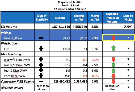
Example of an interpretation: Above, much of the manufacturer’s profit is eaten up by discounts, shown as trade spending, which is used here largely to allow the retailer to discount from MSRP (manufacturer’s suggested retail price) to its ASP (average selling price).

The full amount of trade spending isn’t reflected in that discount amount, and we might suggest reducing the amount of trade spending or re-negotiating with the retailer to reflect more of the discount in the price it charges on-shelf.

2. Candlesticks

Candlesticks help us visualize the spread between the different types of prices seen in retail outlets — spanning from MSRP to the promoted price.

candlestick

Example of an interpretation: You might imagine that the manufacturer wants to move its average price at its Mass channel customer closer to $3.50 but they refuse to do so.

Looking at the candlesticks, we might see some great reasons why: Their Grocery channel competitors are regularly undercutting this Mass retailer, selling as low as $2.39 on promotion and $2.75 on average.  Why would the Mass channel customer want to be undercut even more?  You could understand their point of view.

We can also see that there is poor price discipline.  This company has a suggested price that it rarely, if ever, earns from its consumers. This will lead to high rates of trade spending that might not be necessary.

3. Discount curve

How much do consumers pay on an equivalized basis?  Typically, we would look at price per pound, ounce, gallon, dozen, or some other volume measure, for all the items across a portfolio.

Discount CurveWe ideally see that consumers receive a consistent value across sizes in the portfolio, with a discount as the volume in each package increases. We would want to see a smooth (or, at least, smooth-ish) line sloping from the high index to the low index.

Example of an interpretation: We can view this two ways.  One, the Large package is too expensive on a per-ounce basis, and it should cost less.  Or, two, Small, Medium, and Club size packages should be priced to reflect the value that consumers see in the Family Size package.

There is no one right answer, but the goal is to remove kinks in the discount curve.  An optimal curve would be relatively smooth, without upward or downward kinks.

—————————————

Visualizing prices is an important step as part of strategy work. But in most companies, prices sit on a list for price quotes and internal reference. It’s hard to get visibility into what’s happening in the real world.

Freeing pricing information from that piece of paper transforms it into living analysis that drives strategic decisions.

About the Author

Scott Sanders is a senior consultant at Simon-Kucher & Partners, where he specializes in the consumer packaged goods (CPG) and retail industries covering strategic topics including price, promotion, assortment, and branding.  He previously co-owned Bosco Chocolate Syrup, his family’s business, and held several roles in CPG sales agencies.  He can be reached via LinkedIn.


The post 3 Ways to Kickstart Pricing Discussions with Visualizations appeared first on CPG Data Tip Sheet. Copyright © 2014 CPG Data Insights.

Volume Decomposition, Part 5: Impact of Competition

$
0
0

Robin Simon

This is the fifth in a series of posts on quantifying the impact of business drivers on sales volume.  Please review these posts first to get more context:

Part 1 – Overview of this very useful analytical technique that helps answer the question Why did our volume change?

Part 2 – Impact of Distribution

Part 3 – Impact of Pricing

Part 4 – Impact of Trade

This post focuses on quantifying the impact of Competition.  This business driver is probably the one where judgement comes into play the most, since most people will need to make some educated guesses.  IMPORTANT:  Of all the business drivers, this is the one that relies more on “art” than “science.”  You may want to explicitly note for your audience that the amount of volume change attributed to competition should be used with caution.

In this case study, we are explaining the 2.5% volume change for Magnificent Muffins, shown in the first line of the table below.  I’ll walk through how to determine what the values are in the last 2 columns of the table based on a change in volume of Magnificent Muffins’ key competitor.  I am showing just one competitor but you may want to include more than one, especially if your brand has a relatively low share in the category.  You can see that in this example, the annual volume of Competitor X is about 2/3 the size of Magnificent Muffins volume (128MM vs. 187MM).  More on this a little later.

The key concept here is assuming that some portion of the increase in volume for Competitor X came out of Magnificent Muffins.  There is usually some interaction between most brands within a category – very few households only ever purchase one brand in category over the course of a whole year.  The elasticity for competition is always negative since we would expect our volume to go down when the competitive volume goes up.

Because we are looking backwards and explaining what has already happened, the measure I’ll use for competition is the actual change in volume for Competitor X.  That volume change is up +2,587,622 (+2.0%).  Here’s the relevant data from the table above:

We see that volume sales are up +2.5% for Magnificent Muffins but also up +2.0% for Competitor X.  As mentioned above, the expected direction of the sales impact on Magnificent Muffins for an increase in competitive volume, you would expect a decrease.  So now the question is:   How much did the over 2.5 million pound increase in Competitor X volume come out of Magnificent Muffins volume? 

Estimating Competition Elasticity

The best way to know how much of the volume increase for Competitor X came from sales that would have gone to Magnificent Muffins is by conducting a source of volume analysis based on shopper panel data.  (See this post for an overview of how panel data is different than scanner or POS data which is what we’re using for the volume decomposition.)  Most small- and medium-size companies (and even some large companies) do not have easy access to (or the budget for) a source of volume analysis so here are some things to think about when coming up with your competition elasticity.

  • If your brand is more unique and offers something not available from the competition then you are less likely to be impacted by a change in competitive volume.  On the other hand, if consumers view all brands as pretty much the same and interchangeable then an increase in competitive volume is more likely to come from your brand and a decrease in competitive volume is more likely to benefit your brand.
  • How loyal your buyers are is related to the previous point.  If they are very loyal to you then an increase in competitive volume is less likely to come from your brand.  If there is a lot of switching between brands than a gain for the competition is more likely to come from your brand (and other brands).
  • One of the advantages to being the biggest player is that you tend to be more insulated from the competition.  Unfortunately, if you are a small brand your volume can be highly impacted by a larger competitor’s promotions and/or advertising.
  • Lastly, think about what is happening to the overall category volume.  If a competitor’s volume is up, is that additional volume more likely to be incremental to the category or come from other brands?  The term “expandable consumption” means that if there is more of a product in the house, consumers will use more.  Two classic examples at opposite ends of the spectrum here are snack foods and laundry detergent.  If there snack foods in the house then people are likely to eat more of them and if they are on sale people buy more.  Laundry detergent, however, has a pretty fixed usage rate.  You won’t use more just because it’s in the house or on sale.  (You may buy more when it’s on sale but then you’ll just postpone a future purchase.)  If a category lends itself to expandable consumption then more of a competitor’s volume increase may be growing the category and not stealing from other brands.

In the absence of a source of volume analysis (the best way to do this, mentioned above), we will assume that Magnificent Muffins lost its fair share of volume to Competitor X.  (Regular readers of the CPG Data Tip Sheet may remember some previous posts on fair share.  You’ll see that the term can be used in various ways – fair share of distribution, fair share gap analysis.)

Fair Share of Volume

We need to come up with a reasonable estimate of how much of the 2,587,633 additional Competitor X volume came out of Magnificent Muffins.  It’s obviously something between none of it and all of it!  If these were the only 2 brands in the category and the category volume did not increase over this same period, then all of that increase came out of Magnificent Muffins.  Of course that scenario is highly unlikely!  Let’s see what the overall competitive environment is for the category and between Magnificent Muffins and Competitor X.  Here is the situation:

As you can clearly see in the pie chart above, Magnificent Muffins is the leading brand with a volume share of 43%.  Competitor X is the #2 player with a 30% share and then Competitors Y and Z have smaller shares than that.  In addition, there are 10 other brands that make up the remaining 12% of the category.  Based on this competitive situation, Competitor X is really the only one that is likely to have a significant impact on Magnificent Muffins so that’s why it’s the only one included in the volume decomposition.

If all brands lose their fair share of volume as Competitor X gains volume, then you need to recalculate everybody’s share taking out Competitor X.  Magnificent Muffins’ fair share of Competitor X’s volume gain is 62%.  See the calculation below.

Fair share should be the starting point for your competition assumption.  Fair share represents the case where:
a.  all the competitor’s increase is coming from other brands and none is growing the category OR all the competitor’s decrease is going to other brands and none is just people buying less of the category
b.  consumers of the competitive brand think of all the brands as similar to each other and have no preference between the brands.
Once you calculate fair share (as described below), you should then adjust that based on the factors for low/high competitive impact above.

Calculating The Impact of Competitor X Volume Change on Volume

To calculate the impact of Competitor X on volume, follow the numbered steps for that row in the following table:

The first 4 data columns are facts that are available in most IRI/Nielsen databases or can be easily calculated from what is available:

  1. Year ago = value during the same period a year ago
  2. Current = value in current year
  3. Abs Chg v. YA = absolute change vs. year ago = Current – Year Ago
  4. % chg vs. YA = % change vs. year ago = (Current – Year ago) / Year Ago = Abs Chg v. YA / Year Ago

The calculations in the last two columns need to happen in this order:

  • 5. Expected Impact on Volume = absolute change in Competitor X EQ volume * Magnificent Muffins fair share * -1 = 2,519,413 * 0.62 * -1 = -1,562,036
  • 6. Due-To % Change = Expected Impact / Year Ago EQ Volume for Magnificent Muffins =
    -1,562,036 / 182,754,450 = -0.9%.  The loss of -0.3 weeks of support resulted in a volume loss of over 100,000 LBS.  So a +2.0% increase in Competitor X volume resulted in a -0.9% decline in Magnificent Muffins volume.

The final post in this series will address the remaining row in the table – All Other Drivers, and show a good way to visually summarize the volume decomposition.

Did you find this article useful?  Subscribe to CPG Data Tip Sheet to get future posts delivered to your email in-box. We publish articles about once a month. We will not share your email address with anyone.

The post Volume Decomposition, Part 5: Impact of Competition appeared first on CPG Data Tip Sheet. Copyright © 2014 CPG Data Insights.

Volume Decomposition, Part 6 of 6: Impact of All Other Drivers (aka “Everything Else”)

$
0
0

Robin Simon

This is the sixth and final post in my series on quantifying the impact of business drivers on sales volume.

The first post in the series explains more about when you would want to do an analysis like this.  A volume decomposition analysis allows you to explain why your volume changed by allocating the total change in volume to changes in key business drivers.  There are 4 posts that explain how to analyze the impact of changes in distribution, pricing, trade promotions and competition.  Those are the 4 drivers that are readily available in your IRI/Nielsen database.

 This post focuses on how to calculate the portion of volume change due to everything else, besides those 4 drivers and also wraps up the 6-part series.  In this example I’ll essentially back into the magnitude of the total of all the other drivers not already accounted for.  Although it is possible for some of the “all other” drivers to obtain data outside of IRI/Nielsen and estimate an elasticity, I won’t calculate the volume impact of each of the “all other” drivers individually in this post.

As a reminder, volume for Magnificent Muffins increased by +2.5% or 4,556,679 pounds for the year ending in December 2015 vs. the same period in the previous year.  (Pounds is the equivalized unit, or EQ, for this category.)  So we are trying to explain that change by allocating the appropriate amounts to various business drivers.  The 4 posts mentioned above show how to calculate the expected absolute volume impact of each driver and also how much of the +2.5% increase is due to each driver.

The sum of the expected volume impact from all drivers must be equal to the total change in volume.  In this case, the sum of the drivers we’ve analyzed is just under -2.8 million pounds:

5,436,887 – 7,538,185 – 66,251 + 538,866 + 505,033 – 113,631 – 1,562,036 = -2,799,317

So, if the total volume change is +4,556,679 and the impact of the drivers we’ve already analyzed then other things that happened had to account for +7,355,996:

And you can calculate the Due-To % Change for All Other Drivers in a similar way.  The sum of the Due-To % Chg numbers must be equal to the % Change vs. Year Ago for volume, in this case +2.5%.  The sum of the Due-To % Change for the analyzed drivers is -1.5% (= +3.0% – 4.1% – 0.0% + 0.3% + 0.3% – 0.1% – 0.9%).

So our completed volume decomposition looks like this:

OK, so maybe this was not the best example to use since the % change due-to All Other Drivers (sometimes called the “Unexplained”) is bigger than the total % change in volume (+4.0% vs. 2.5%)!  But this is real and gives me an opportunity to talk about what might all those other drivers be (or not be).  The chart below summarizes many of the other things that cause volume to change  but are not accounted for by facts available in your IRI/Nielsen database.

Some of these other drivers are specific to your brand or to competitors and others are more general in nature and affect categories and brands across the store and possibly across the entire economy.  Advertising can be more traditional media like TV, radio, print, out-of-home but also includes digital.  Social media (Facebook, Instagram, Pinterest, online reviews, etc.) has become very important for many brands.  Shelving measures like linear feet, shelf location and facings are typically not available in regular IRI/Nielsen databases.  Consumer promotion and many shopper marketing programs also drive volume.  These include things like FSIs, instant coupon machines, digital coupons, in-store sampling, etc.  Examples of consumer trends are an increased desire for convenience or increased popularity of gluten-free items.  Economic variables like disposable income or inflation can often impact spending on entire categories while unusually hot or cold weather can increase or decrease your sales, depending on the seasonality of your product.  When there was a change in the legal drinking age in some states, sales of beer and wine adjusted accordingly.  An unexpected one-time event (like a black-out, general transportation strike, bad crop year, etc.) can impact many industries.

For Magnificent Muffins, the 4% volume increase from All Other drivers was due to a combination of:  more/better advertising, introducing a Facebook page, a very successful sampling program. They also benefitted from a competitor having supply problems for a few months during the year, which I chose not to include in the Competition example for simplicity reasons.

And just to tie this all together visually, here is a waterfall chart which is often used to display the results of a volume decomposition:

Did you find this article useful?  Subscribe to CPG Data Tip Sheet to get future posts delivered to your email in-box. We publish articles about once a month. We will not share your email address with anyone.

The post Volume Decomposition, Part 6 of 6: Impact of All Other Drivers (aka “Everything Else”) appeared first on CPG Data Tip Sheet. Copyright © 2014 CPG Data Insights.

Using TDP to Enhance Your Analysis, Part 1: Velocity

$
0
0

Sally Martin

Velocity for Groups of ProductsTDP (a.k.a. Total Distribution Points) is my favorite syndicated data measure. Why? Because distribution is fundamental to any business question. Therefore, it’s a great place to start when looking for answers. And TDP is the broadest, most flexible way to examine this crucial dimension.

If you are looking at individual UPCs, you don’t need TDP – it’s the same as % ACV. But any time you’re working above the UPC level, TDP will help you understand the depth and breath of distribution across a group of products. For a group of products, % ACV just addresses breadth (the distribution for at least one product in the group).

In a series of three posts, I’m going to illustrate three ways to use TDP in your analysis: velocity, sales trends and sales productivity. To get the most from these posts, you’ll need to understand the basics of TDP and the concept of velocity.

In this post, I’m going to illustrate my analysis with a fictional yogurt category. Caution: This is fake data! Do not use this in your yogurt business plan! (Actually, it’s real data—but not for yogurt.)

The Most Common Use of TDP: Velocity Denominator

The simplest, most common use of TDP is as a component of velocity. Both Nielsen and IRI (regardless of the form in which you get the data or the tool you use) provide two velocity measures:

  1. Sales per point of distribution
  2. Sales per million dollars of ACV.

(If I’ve lost you, allow me to again point you to this velocity primer.)

Conceptually, velocity can be expressed as:

Sales ÷ Distribution

However, if your group of products has distribution of 100% (or close to it), basic velocity measures become meaningless. Allow me to demonstrate:


In the table above, I’ve indexed the values for each segment to the average segment. Indexed Units, indexed Units per Point of Distribution, and indexed Units per $MM ACV are all identical. The two classic velocity measures (Units Per Point and Units Per Million) add nothing to our understanding of the differences across segments. Because % ACV for the group of products is 100%, these measures of velocity provide no more differentiation than total units.

Now, let’s use TDP in our analysis instead of % ACV:


Units per TDP gives a very different picture of the strength of each segment. “Fruit-on-the-Bottom Yogurt” and “Drinkable Yogurt” generate about the same number of units. But Drinkable Yogurt does it with a fraction of the variety (and presumably shelf space since the two generally correlate).

Technical side note: Some databases will have TDP measures. Some will not. If you don’t have TDP measures, you can calculate them. To get TDP, sum item level % ACV and multiply by 100 (because TDP is not a %). Then sum up units for the same group of products. Then manually calculate Units per TDP.

Now suppose you want to compare across markets. You need to factor in retailer/market ACV. Why? Because Units Per Point of TDP will naturally be higher for a large store than a small store.

So how do you work TDP into your Units Per Million number?

I solve this dilemma by multiplying TDP by total market ACV and then use that as the denominator in my velocity calculation. “Total market ACV” means sales across all products, not just the ones you are analyzing. If you are confused by this concept, learn more about ACV here.

See the table below for an example of this calculation. I’ve run it for two different (pretend) retailers so you can compare the results (shaded in blue).


A couple of notes about this chart:

  • You’ll see that my homemade measure doesn’t result in an intuitive number. That’s always a problem with “per million” velocity calculations. In an upcoming post, I’ll give some suggestions for how to make non-intuitive measures more user friendly. But for now, let’s just live with it and look at the relative numbers.
  • Some databases will have a measure that is, in some cases, comparable to my homemade measure. In Nielsen Answers it’s called: “Units / $MM ACV / Item”. IRI may have something similar – email me or post a comment if you have the IRI measure name. This measure will be comparable to my measure only if % ACV for the group of products is 100% or close to 100%. Why? I think that’s a whole ‘nother post. For now, take my word for it.
  • If you need to calculate my measure, you may also need to calculate Total Market ACV. To do that, pick a product or product group with 100% distribution. Then divide Sales by Sales Per Million. For example, using the first line of the Table 1: 1,120,278 / 350 = $3201 MM. I converted this to billions in Table 3, just to make the numbers tidier ($3.2 billion). You get approximately the same market ACV number no matter which product line you use, if it’s the same market and % ACV = 100%. I’ve written a whole post on this calculation if you want to go through it step by step.

So, what does this table tell us about yogurt? Here’s what I see:

  • Retailer ACV: Foodville Markets sells a lot more yogurt than Shop-A-Lot, but Foodville is more than twice the size of Shop-A-Lot, so it had better sell more!
  • % ACV: % ACV for the segments is 100% across both retailers (which means they both sell all the segments in all their stores) so we need to go to TDP to understand more about relative segment performance.
  • % TDP: TDPs are distributed across segments fairly evenly at the two retailers. There are some differences but they are subtle (we’ll get back to that in a moment).
  • Units per (TDP * ACV): When we incorporate TDPs, we see that yogurt velocity is significantly lower at Foodville ($90 vs. $130 for Shop-A-Lot). The segments with the greatest discrepancies are “Fruit-On-The-Bottom” and “Whipped.”

The Fruit-on-the-Bottom differences deserve more scrutiny because that’s the second biggest segment. Going back to those subtle % TDP differences, we see that this value is lower for Foodville, so the retailer may be missing some crucial variety. Or perhaps the price is off. Or the demographics of Shop-A-Lot are better for this segment. At this point, we don’t know for sure.

And this is how you work the analysis. Basically, you generate a bunch of hypotheses and then dive deeper into the segment to see which ones hold. Ultimately, your objective is to come up with recommendations for the retailer.

We can apply the same pattern of thinking to “Whipped Yogurt,” which is also performing poorly. Even though it’s a much smaller segment, it could be very high priority for the manufacturer or the retailer (maybe it’s the high growth segment or has higher margins).

Another hypothesis to investigate is whether Foodville has too much variety in the yogurt category. Given its lower velocity, the solution might be to pull weaker items out of each segment. Ultimately, the decision will depend on the retailer’s goals and how this category compares to others. My sample data provides no definitive answers because we lack context. But regardless, this example illustrates the power of bringing TDP into the analysis.

You can also apply this type of analysis at the brand level or for promoted product groups. Basically, it’s a useful tool in any situation where you have groups of products and want to get a big-picture view of distribution across the entire group.

How do you use TDP? Share your analysis tips and tricks below.

Did you find this article useful?  Subscribe to CPG Data Tip Sheet to get future posts delivered to your email in-box. We publish articles about once a month. We will not share your email address with anyone.

The post Using TDP to Enhance Your Analysis, Part 1: Velocity appeared first on CPG Data Tip Sheet. Copyright © 2014 CPG Data Insights.

Viewing all 67 articles
Browse latest View live